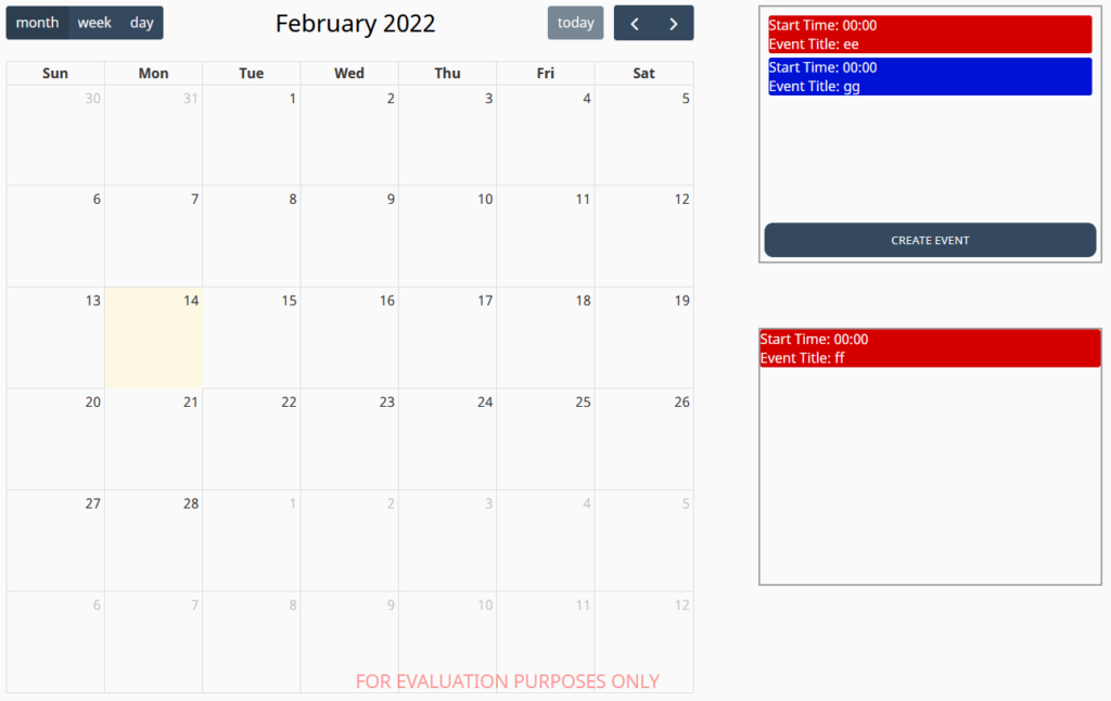
External Event Box Component
This component holds events for the Calendar component that can be dropped onto the calendar.
Properties
- Events – an array of events that can be dropped on to the calendar component. Only the title property is required. All other properties are optional.
- title – The title of the event
- eventColor – The border and background color of the event
- eventTextColor – The color of the text on the event
- startTime – The start time of the event as a string in the format HH:mm:ss
- duration – the duration of the event as a string in the format HH:mm:ss
- Event Color – The default background and border color to use for the event
- Event Text Color – The default text color to use for the events
- Show Create Button – Whether to display the button for creating events in the component using the default event creation pop up.
- Button Style – Controls the button colour and text colour for the create event button for default and hover states
- Flex – Exposes a number of flex properties for the internal flex-box that holds the events.