Calendar Component
An implementation of fullcalendar.io version 5 as a perspective component.
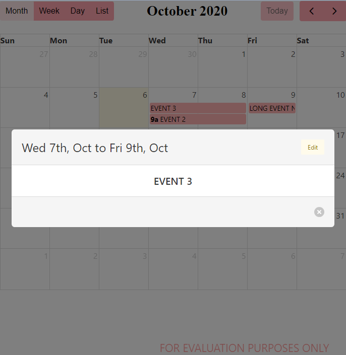
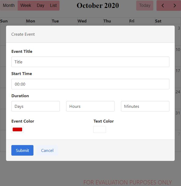
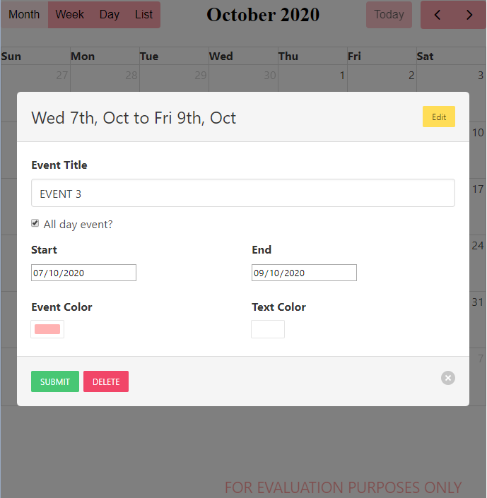
There are two pop ups built in to the calendar available for use that are disabled by default. The Event Pop will display when an event is clicked on and the ability to edit the event on that pop up can be controlled as well. The Create Event Pop will appear when a date is clicked on regardless of if the selectable property is true. Neither of these pop ups affect the calendar directly and instead send any changes through to the designer through events.
Upgrading from a previous version to 1.7? This page details the changes to be aware of.
Calendar Component Changelog
External Event Box Component
Properties
- Editable – Allows for dragging and resizing of events.
- Selectable – Allows for selecting s single date or range of dates.
- Selected Date – When “selectable” is true and a selection is made, these readonly properties will display the current selection.
- Default View – The initial view displayed when opened
- Current View – The currently displayed view. When written to the current view will change to the value given. If an invalid view is written the component will error out. Current Valid Views:
- dayGridMonth
- dayGridWeek
- dayGridDay
- timeGridWeek
- timeGridDay
- listMonth
- listWeek
- listDay
- Event Pop Properties
- Use Event Pop – Whether the default pop up for showing event details will appear when an event is clicked on.
- Can Edit Event on Pop – Whether the edit button will appear on the default event pop up.
- Can Export Event on Pop – Whether the event can be exported as an iCal object.
- Use Create Event Pop – Whether the default pop up for creating events will appear when a date or time box is clicked on.
- Events – An array of event objects to display in the calendar. Events have a number of properties, all with string values:
- title: The text to display on the event
- start: REQUIRED When the event starts as a parseable string. Can include a time. If no “end” is defined, it defaults to being an All Day event on the start date. If “start” is defined with a time but “end” is not defined for the event, the default duration for the event is one hour.
- end: When the event ends. Can include a time Note: This value is exclusive. For example, if you have an all-day event that has an “end” of “2020-09-03”, then it will span through “2020-09-02” and end before the start of “2020-09-03”
- duration: A string in the format HH:mm that can be used to define the end point for an event instead of explicitly putting it in.
- allDay: A boolean value that if set to “true” will have the event ignore any time portion of the “start” and “end” properties.
- borderColor: The color around the border of the event.
- backgroundColor: The color in the background of the event box. Also used in the dots at the side of the list view.
- textColor: The color of the text on the event.
- id: An id for the event. Defaults to an empty string if not provided.
- rrule: The documentation for the rrule property is found here
- Other properties can be added but may not be supported by the calendar component, nor will they be passed back by events.
- Event Display
- Event Display Type – Controls which preset rendering style events use. The following options are available.
- ‘auto’ – When in daygrid, renders the event as a solid rectangle if it is all-day or multi-day. If a timed event, will render it with a dot. When in other views, will render normally.
- ‘block’ – When in daygrid, renders the event as a solid rectangle. When in other views, will render normally.
- ‘list-item’ – When in daygrid, renders the event with a dot. When in other views, will render normally.
- ‘background’ – turns events into background highlights.
- ‘inverse-background’ – like background but fills the reverse space.
- ‘none’ – will not render the event.
- Color – The default background and border colour of the events.
- Background Color – The default background colour of the events. Overrides the Color property
- Border Color – The default border color of the events.
- Font – The colour, weight, size and family can all be set.
- Display Event Time – Whether to display the start time on any events that are not all day events and have a time set.
- Next Day Threshold – The minimum time it must be on an event that spans across days to be rendered on that day on a dayGrid view. For example, if set to 09:00:00 and an event had it’s end on 02:00:00 it would not render on the final day of the event, only any days leading up to it.
- Event Order – How to display events when they are occupying the same space. Uses properties from the events and a “-” denotes descending order.
- Slot Event Overlap – Determines if timed events in TimeGrid view should visually overlap
- Event Display Type – Controls which preset rendering style events use. The following options are available.
- Current Calendar Date – A set of properties reflecting the current state of the calendar being shown. All properties but year, month and date are readonly. Writing to the year, month or date properties will change the calendar to the value written.
- Date – An ISO 8601 format string (YYYY-mm-dd) of the current date being displayed. Can be written to to change the displayed date but only if the “dateIsReadOnly” property is set to False
- Date Is Read Only – When False, any value written to the “date” property will change the currently displayed dates to show the value written.
- Week – The ISO week of the year
- Display Date Start – The first visible date on display. In month view this might not be the first of the month as not all months start on the same day.
- Display Date End – The last visible date on the display. This value is exclusive.
- Current Date Start – The first date of the range the view is trying to represent.
- Current Date End – The last date of the range the view is trying to represent. This value is exclusive.
- Title – What is currently being displayed through the “title” propery used in the toolbars.
- Date and Time Display – Used to define how dates and times are displayed and even which date and times to display
- First Day – What day to use as the first day of the week on a day grid view. 0 = Sunday
- Minimum and Maximum time – The bound on the time to be displayed on a time grid view
- Nav Links – Whether to use parts of the calendar as links to other views. For example, the date numbers on a month view will take the calendar to a time grid day view of that day.
- Week Number – Whether to display weeke numbers when possible.
- Use ISO Week Calc – Whether to use ISO week numbers or localised week numbers.
- Week Label – The label to appear in front of the week number when needed.
- Now Indicator – Whether to show a red line to indicate now on a time grid view
- Today Color – The color for the indicator for the current date
- Slot Duration – The duration of each time slot on a time grid view.
- Expand Rows – If the rows of a given view don’t take up the entire height, they will expand to fit.
- Snap Duration – The time interval at which a dragged event will snap to the time axis.
- Slot Label Format – The format of the time shown in a time grid view as a Date Format object. More information can be found on this fullcalendar.io doc page
- All Day Text – The text to show on the all day slot of a time grid view.
- Weekend – Whether to show weekend on the calendar.
- Hidden Days – An array of integers of which days to hide from the calendar. Days are indexed from 0 = sunday and range 0-6.
- Business Hours – Can be set to false or an object or array of objects describing a time period to emphasize on the calendar. As examples, Monday to Friday 9am to 5pm would be
{"daysOfWeek": [1,2,3,4,5], "startTime": "09:00", "endTime": "17:00"}and having different hours on different days would be[{"daysOfWeek": [1,2,3], "startTime": "08:00", "endTime": "18:00"},{"daysOfWeek":[4,5], "startTime": "10:00", "endTime": "16:00"}] - Time Zone – Changes the time zone of the calendar. Can accept the following options:
- local – Uses the browser time zone
- gateway – Will pull the time zone from the gateway through the perspective session props
- custom – Sets the time zone to
localbut allows for a customnowproperty to be set - A time zone identifier – A string describing the time zone like
America/New_YorkorAsia/Shanghai
- Now – When the
timeZoneproperty is set tocustomthis will adjust the now property to the ISO formatted date entered
- Toolbar – Contains the settings for the toolbars that can be displayed on the Calendar.
- Header/Footer – What to display in either the header or footer. Either the header or footer can be set to “false” instead of an object to remove it. The header and footer are defined by an object with three string inside it called “left”, “center” and “right”. Any of these can be ommited and are built using a comma seperated list using the following choices. Any blank spaces between commas act as a gap between buttons:
- title – The current title generated by the calendar
- prev – Button for going back one month/week/day
- next – Button for going forward month/week/day
- prevYear – Button for going back a year
- nextYear – Button for going forward a year
- today – Button for returning the calendar to the current month/week/day
- Any view name – Creates a button to take the calendar to the view chosen. Examples: dayGridMonth, timeGridWeek, listMonth.
- Title – The font color, size, weight and family can be defined. A separator can also be defined for when a date range is shown.
- Buttons – The button colour and font styling can be set for primary, hover and active states.
- Button Text – The default text for each type of button can be chosen.
- Header/Footer – What to display in either the header or footer. Either the header or footer can be set to “false” instead of an object to remove it. The header and footer are defined by an object with three string inside it called “left”, “center” and “right”. Any of these can be ommited and are built using a comma seperated list using the following choices. Any blank spaces between commas act as a gap between buttons:
- Popover
- Day Max Events – In, dayGrid view, the max number of events within a given day, not counting the +more link. The rest will show up in a popover. If
trueis specified, the number of events will be limited by the height of the day cell.
- Day Popover Format – The format of the date displayed in the popover as a Date Format object. More information can be found on this fullcalendar.io doc page
- More Link Content – What to display in the link displayed when the event limit is reached. This property can also accept html wrapped as an object like
{ html: '<i>some html</i>' } - More Link Click – Determines the action taken when the user clicks on a “more” link. It accepts the following options:
- popover – Displays a rectangular panel over the cell with a full list of events for that day.
- week – Goes to a week view, as determined by the views in the header toolbar.
- day – Goes to a day view, as determined by the views in the header toolbar.
- Any view name – goes to the specified view
- Day Max Events – In, dayGrid view, the max number of events within a given day, not counting the +more link. The rest will show up in a popover. If
- View Properties – Many of these are Date Format objects that can be changed to a value set to false to remove them from display. More information on Date Format objects can be found on this fullcalendar.io doc page
- Day – For day views, the column header and view title formats can be defined by Date Format objects.
- Week – For day views, the column header and view title formats can be defined by Date Format objects.
- Month – For Month views, the column header and view title formats can be defined by Date Format objects.
- Fixed Week Count – When true every month view has the same number of weeks shown regardless of how many days in the month there are.
- Show Non-Concurrent Dates – When true displays the dates from the previous and next months that can be shown.
- Day Grid – Can have the column header turned off and the event time format is defined by a Date Format object.
- Time Grid – Can have the column header turned off and the event time format is defined by a Date Format object. The All Day slot can also be turned off.
- List – A message can be defined for when there are no events to display. The listDayFormat and listDaySideFormat are Date Format object defining how the day is displayed on the left and right side of the day box. Each can be set to false to remove them.
- Locale Settings
- Locale – Takes a language code that will change the header/footer title, grid view headers and list item headers to the selected language and date format. Supported locales list.
- Dir – Can be set to “ltr” or “rtl” to change the direction that elements in the calendar are rendered. This is for use with right-to-left languages such as Arabic and Hebrew.
Component Events
On Date Click
Triggered when a date or time block is clicked on the calendar.
- event.date (object) – A date object containing the date and time of the block clicked
- event.dateStr (string) – An ISO 8601 formatted string representing the block clicked
- event.altKey (boolean) – Whether the alt key was held when the event was fired
- event.shiftKey (boolean) – Whether the shift key was held when the event was fired
On Event Click
Triggered when an event on the calendar is clicked. Dates are returned in the format “YYYY-MM-DD HH:mm:ss”
- event.id (int) – The id of the event. If one was not supplied returns None
- event.title (string) – The title of the event
- event.start (string) – The start of the event as a string
- event.end (string) – The end of the event as a string. Single day allDay events will return None
- event.allDay (bool) – Whether the event runs across full days or uses the time component for it’s start and end
- event.altKey (boolean) – Whether the alt key was held when the event was fired
- event.shiftKey (boolean) – Whether the shift key was held when the event was fired
On Event Dropped
Triggered when an event is moved and dropped onto another date or time. Dates are returned in the format “YYYY-MM-DD HH:mm:ss”
- event.id (string) – The id of the event. If one was not supplied returns an empty string
- event.startDate (string) – The start of the event as a string
- event.startTime (string) – The start time of the event as “HH:mm:ss”
- event.endDate (string) – The end of the event as a string. Single day allDay events will return None
- event.endTime (string) – The end time of the event as “HH:mm:ss”
- event.allDay (bool) – Whether the event runs across full days or uses the time component for it’s start and end.
On Event Resized
Triggered when an event is resized and the final size is different. Dates are returned in the format “YYYY-MM-DD HH:mm:ss”
- event.id (string) – The id of the event. If one was not supplied returns an empty string
- event.startDate (string) – The start of the event as a string
- event.startTime (string) – The start time of the event as “HH:mm:ss”
- event.endDate (string) – The end of the event as a string. Single day allDay events will return None
- event.endTime (string) – The endtime of the event as “HH:mm:ss” Single day allDay events will return None
- event.allDay (bool) – Whether the event runs across full days or uses the time component for it’s start and end
On Selection Made
Triggered when “selectable” is true and a range of dates has been selected. Dates are returned in the format “YYYY-MM-DD HH:mm:ss”
- event.selectStart (string) – The start of the selection
- event.selectEnd (string) – The end of the selection
- event.altKey (boolean) – Whether the alt key was held when the event was fired
- event.shiftKey (boolean) – Whether the shift key was held when the event was fired
On Event Created
When the default Event Create Popup is being used, this event triggers when the form is submitted. Dates are returned in the format “YYYY-MM-DD HH:mm:ss”
- event.title (string) – The title of the event
- event.startDate (string) – The start date of the event
- event.startTime (string) – The start time of the event as “HH:mm:ss”
- event.endDate (string) – the end date of the event
- event.endTime (string) – The end time of the event as “HH:mm:ss”
- event.eventColor (string) – The colour of the event background and border as a hex code
- event.eventTextColor (string) – The colour of the event text as a hex code
- event.allDay (bool) – Whether the event runs across full days or uses the time component for it’s start and end
On Event Edited
When the default Event Pop Up is being used and the edit mode has been used and submitted, this event will be triggered. Dates are returned in the format “YYYY-MM-DD HH:mm:ss”
- event.title (string) – The title of the event
- event.startDate (string) – The start date of the event
- event.startTime (string) – The start time of the event as “HH:mm:ss”
- event.endDate (string) – the end date of the event
- event.endTime (string) – The end time of the event as “HH:mm:ss”
- event.eventColor (string) – The colour of the event background and border as a hex code
- event.eventTextColor (string) – The colour of the event text as a hex code
- event.allDay (bool) – Whether the event runs across full days or uses the time component for it’s start and end
On Event Deleted
When the default Event Pop Up is being used and the delete button is pressed, this event will be triggered.
- event.id (string) – The id of the event to delete. If one was not supplied returns an empty string
On Event Received
When an event is dropped onto the calendar from outside (using the External Event Box component) this event will be triggered.
- event.title (string) – The title of the event
- event.startDate (string) – The start date and time of the event
- event.startTime (string) – The start time of the event
- event.endDate (string) – The end date and time for the event
- event.endTime (string) – The end time of the event
- event.allDay (boolean) – Whether the event is an allDay event or not
- event.eventColor (string) – The background and border color of the event
- event.eventTextColor (string) – The color of the text on the event
To download a trial of the Calendar module please enter your email below – a link to download will be provided. We will not contact you unless you ask for support or you ask for a license. If you would like to purchase a licence for $400 please contact us at module.support@bijc.co.uk
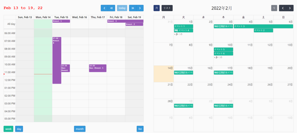
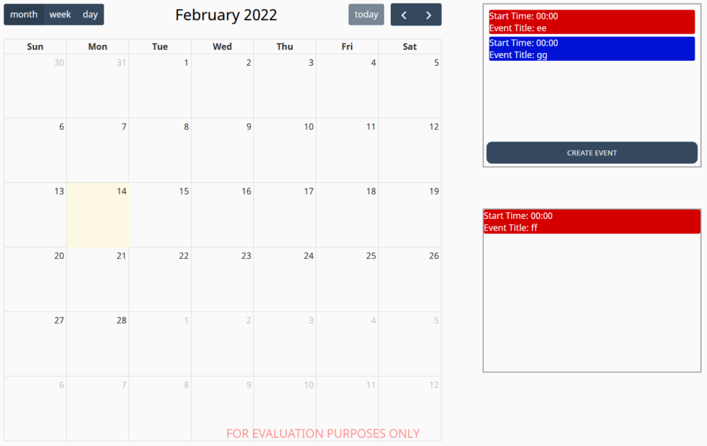
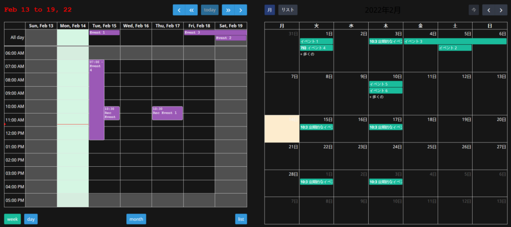
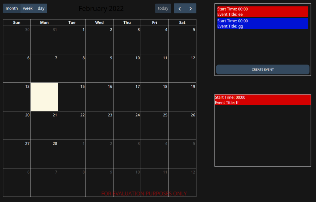
Component Images