
Plotly Module
An implementation of the plotly.js library as a perspective component.
8.1 Module Download Link (Plotly.js v3.3.1)
The 8.1 module is no longer being developed. This download is for legacy systems that require it.
8.3 Module Download Link (Plotly.js v3.3.1)
A single component provides support for all plotly chart types through a flexible set of properties. Seventeen variants are included as examples of creating some of the charts.
Plotly.js Documentation
Plotly.js Figure Reference Documentation
Property Model
The component has four properties:
| Property | Description |
|---|---|
| data | Array of JSON objects describing the traces ti display on the chart |
| layout | Attributes for the chart |
| config | Configutation for the chart |
| events | Provides the ability to turn off default behaviour for some events |
Data
Each object in the data array describes a trace to be displayed on the chart. The properties available for the trace depend on what the type property is set to. Traces are categorised on the chart by trace type.
The following is an example of the data property used to createa bar chart with two groups of data:
[
  {
    "x": ["giraffes", "orangutans", "monkeys"],
    "y": [20, 14, 23],
    "name": "SF Zoo",
    "type": "bar"
  },
  {
    "x": ["giraffes", "orangutans", "monkeys"],
    "y": [12, 18, 29],
    "name": "LA Zoo",
    "type": "bar"
  }
]
Layout
The layout property defines the attributes of the chart including things like the title, axes and annotations.
The following is an example of the layout property being used for a waterfall chart:
{
  "title": {
    "text": "Profit and loss statement 2018"
  },
  "xaxis": {
    "type": "category"
  },
  "yaxis": {
    "type": "linear"
  },
  "showlegend": true
}
Config
The config object is used for the configuration of certain properties on the chart.
The following show some of the properties that can be set using the config property:
{
  "displayModeBar": true,
  "modeBarButtonsToRemove": ["toImage", "select2d"],
  "locale": "fr",
  "displaylogo": false
}
Event Handlers
A number of events are provided by the module that allow you to respond to various events such as clicking on the trace or making a selection on a trace.
- onClick
- onDoubleClick
- onHover
- onUnHover
- onLegendClick
- onLegendDoubleClick
- onSelecting
- onSelected
The default behaviour for the onLegendClick and onLegendDoubleClick events can be turned off using the properties inside the event property of the component.
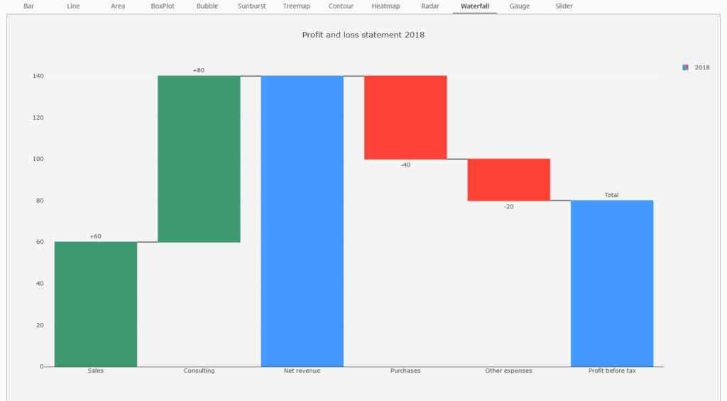
Waterfall Chart 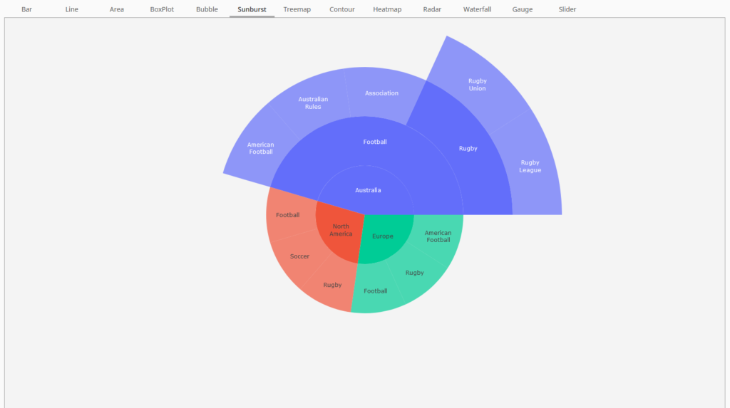
Sunburst Chart 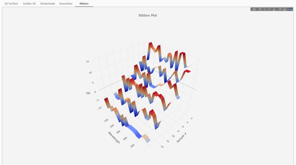
Ribbon Chart 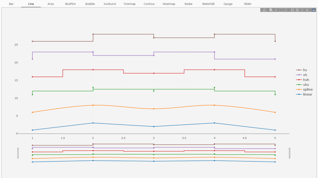
Line Chart 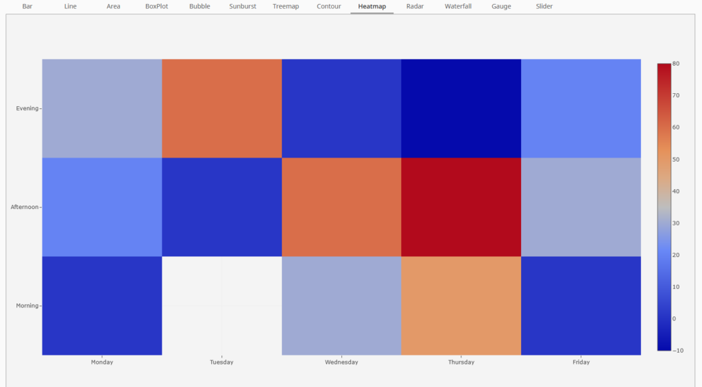
Heatmap Chart 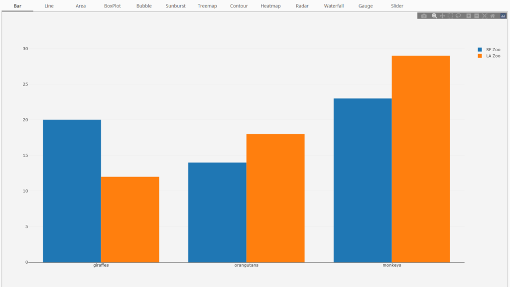
Bar Chart 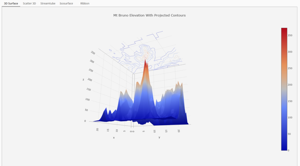
3D Surface Chart